So these appear to be the pixel coordinates of the center of the subject area (from top left) along with its width and height
So about here:

So these appear to be the pixel coordinates of the center of the subject area (from top left) along with its width and height
The Shard! Very nice, I just took one too:

So the camera would AF on this rectangle and ignore everything else? That's a low contrast area. Maybe not impossibly low contrast for the camera to handle.So about here:

That's a 4:3 image.So about here:

And I think this image is the highest resolution of the object itself. (At least for pixels, not sure if it has any additional compression/changes)This might be un-cropped. Closest to it that I can find, anyway.


But it's 720x1279, close to 9:16, and probably resized from the original.This might be un-cropped. Closest to it that I can find, anyway.
It's a 170KB JPEG. Low resolution...
And I think this image is the highest resolution of the object itself. (At least for pixels, not sure if it has any additional compression/changes)
Here's what I think happened:It remains puzzling to me. Maybe it's just an off hand snapshot. But for a Pro to take something this poorly composed. It would hurt my teeth. Why vertical? Why that lens? I'd use the zoom telephoto and horizontal format. Play around with the zoom. Get rid of the clutter in the foreground.
But what about using the 3x power optical capability for a UFO photo? I just don't get it. If this were a naive non-photographer, I'd understand.
Any chance you can experiment with a vertical photo?I took the same image with five differen focus point. Top Left, Top Right, Bottom Right, Bottom Left, and Center.
Orientation top, left (0°) top, left (0°) top, left (0°) top, left (0°) top, left (0°) Image resolution 72 x 72 dpi 72 x 72 dpi 72 x 72 dpi 72 x 72 dpi 72 x 72 dpi Image size 4032 x 3024 4032 x 3024 4032 x 3024 4032 x 3024 4032 x 3024
Subject area for each
Subject Area 407 687 747 752 3431 705 747 752 800 2547 747 752 3440 2571 747 752 2063 1585 747 752
So these appear to be the pixel coordinates of the center of the subject area (from top left) along with its width and height

Maybe he was trying to take a selfie with the self-timer. Maybe that would explain the vertical photo. And the close focus... if that really was the way he set it.Here's what I think happened:
His car broke down. The panorama was nice, with the moving cloud shadows. He propped the phone up on the ground, maybe using a small tabletop stand, and took a sequence of pictures. One picture happened to catch the "orb".
Nice, but we're interested in the "wide" camera, not the ultra-wide.
We can see well defined borders between the scales on the wings.
Angles, margins, cell and most characteristic veins of a butterfly wing. 1. Discal cell. 2. Discocellular vein complete. 3. Discocellular vein poorly developed. Sc = subcostal vein; R, R1, R2, R3, R4, R5 = radial veins; Rs = radial sector; M1 M2 M3 = medial veins; CuA, CuA1, CuA2 = anterior cubital veins; CuP = posterior cubital vein-vestigial in Papilionidae; 2A, 3A = anal veins; H = humeral vein; Sc+R1 = composite vein formed from the fusion of Sc and R1 of hindwing.
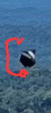
When I hold my phone out in front of me, I don't usually have blades of grass in the foreground.When he was taking the second photo he was holding the phone out in front of him and kind of saw the Orb, naked eye, at the same time.
Please, not "clutter". As an artist, I appreciate his inclusion of the foreground foliage to give depth to the scene. It's practically the only thing that makes me think the photographer knew what he was doing, compositionally. Cover it with your hand and you'll see how dull it would be if it just carried that shadowed blue down to the margin.It's an embankment on the side of the road. How high is unknown. I would have climbed the embankment to get a cleaner landscape. But maybe he likes clutter in the foreground.
I thought of them as "panes", but that doesn't seem to be the official name. However I found this interesting article:Not pedantic. That needed to be corrected.
The "borders" I've been talking about are veins. The areas between the veins... don't seem to have a name.

https://phys.org/news/2020-01-wings-butterflies.html
A new study from Columbia Engineering and Harvard identified the critical physiological importance of suitable temperatures for butterfly wings to function properly, and discovered that the insects exquisitely regulate their wing temperatures through both structural and behavioral adaptations.
Contrary to common belief that butterfly wings consist primarily of lifeless membranes, the new study demonstrated that they contain a network of living cells whose function requires a constrained range of temperatures for optimal performance. Given their small thermal capacity, wings can overheat rapidly in the sun when butterflies cease flight, and they can cool down too much during flight in a cold environment. The study, published online today by Nature Communications, is the first to explore the implications of temperature in shaping the wing structure and behavior of butterflies.
So, you like stark minimalism.So, you like clutter.
")
...has something of an ability to take information (e.g. a photo of a vase), find (or infer) qualities that seem -to some of us- superfluous and then make extraordinary claims based on those implied qualities.The same person who did draw some circles over a vase
maybe he was IN the car. his girlfriend driving to the nature preserve right down the road they were going to (lots of scenic amazon stuff on the tour) and he said Stop!" because the scene was pretty. because it is.It's an embankment on the side of the road. How high is unknown. I would have climbed the embankment to get a cleaner landscape. But maybe he likes clutter in the foreground.
In landscape photography it's called "foreground interest" a compositional technique to help with scale and draw the viewer's eye through the scene naturally.It's an embankment on the side of the road. How high is unknown. I would have climbed the embankment to get a cleaner landscape. But maybe he likes clutter in the foreground.
But it has definitely undergone some manipulation (anti-aliasing?). The resolution of the object (about 230x260 pixels in your picture) is way to high to fit the original picture ( 2268×4032 ) since it would take up 10% of the width of the original.No, this is. Download and compare. This one is much less pixelated. We can see well defined borders between the scales on the wings.

still hasn't been released to the general public, however after reading some of the comments on reddit this seems his default behaviour.the most studied UFO photo in existence
How wide do we expect the original to be? About 19-20 pixels? Do we have a version like that?But it has definitely undergone some manipulation (anti-aliasing?). The resolution of the object (about 230x260 pixels in your picture) is way to high to fit the original picture ( 2268×4032 ) since it would take up 10% of the width of the original.
So yes that object has a higher resolution, but is also probably blown up from the original and messed with. So I have the impression that the one I posted is 'closer' to the original.
In this version:How wide do we expect the original to be? About 19-20 pixels? Do we have a version like that?
The low resolution versions we have (that don't appear to be cropped) the thing is about 7x7.In this version:
it is about 30 by 30 pixels, which seems about right to me.
The original JPEG has artifacts the repeated processing causes more rounding errors and recompression artifacts eventually the image "falls apart"
JPEGs are not bitmaps or raw data,
Yeah they are already there, but the processing bring out more macroblock artifacts, you are just not meant to edit JPEGsYou don't need repeated processing in order to bring these about, but it certainly helps.
The clue to the noise is clear when you see where it occurs most - near the text. In order to represent a hard edge, such as the strokes of text, you need high frequency components to be preserved, and that means the whole block will be awash with high frequency noise.